Contact Typefaces Custom About
Added to the cart
Name of the font + style
Type of license
Price

Sweden
SANS

Sweden Sans
3 latin weights and 1 arabic weight
Commissioned by
Swedish Institute
Client
Swedish Institute is a Government agency in Sweden with the responsibility to spread information about Sweden outside the country.
Design Team
Jesper Robinel, Stefan Hattenbach
Year
2014
Status
Completed

Not too much, but not too little. Something in-between and right in the middle. Sweden Sans, a lagom typeface.

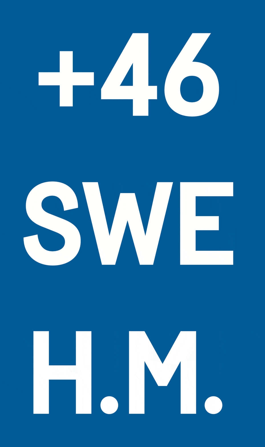
Taking on one challenge of a kind, which is to design a typeface that reflects the heart and soul of a country, Sweden Sans was created as a unique yet practical and versatile typeface – we call it a ‘Lagom’ typeface.


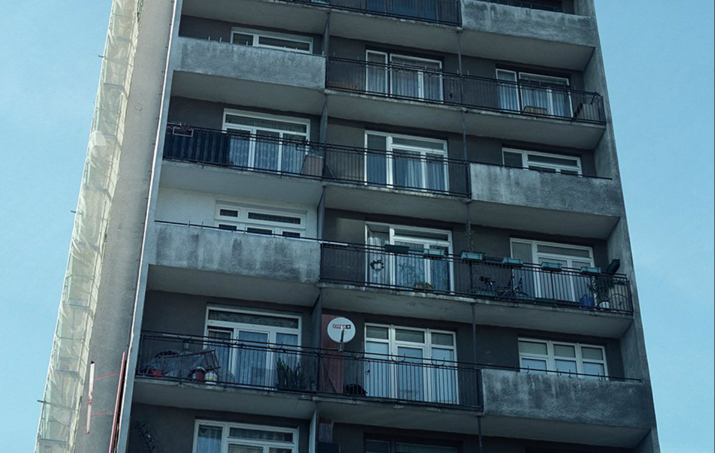
Old road signs, monospaced fonts, classic sans serifs and Scandinavian design were the inspiration for a typeface developed as part of a new brand identity at the request of the Swedish government. It comes in 4 weights – Light, Regular, Bold and one weight Arabic version.

Light, Regular, Bold, العربية
Sweden Sans Light

A cohesive, strategic yet practical brand identity program was created for the Council for the Promotion of Sweden (Ministry for Foreign Affairs, Visit Sweden, Business Sweden and the Swedish Institute). This is a brand identity that needs to unify the organizations as well as clearly represent each individual institution when communicating Sweden abroad.

Sweden Sans Regular

A cohesive, strategic yet practical brand identity program was created for the Council for the Promotion of Sweden (Ministry for Foreign Affairs, Visit Sweden, Business Sweden and the Swedish Institute). This is a brand identity that needs to unify the organizations as well as clearly represent each individual institution when communicating Sweden abroad.

Sweden Sans Bold

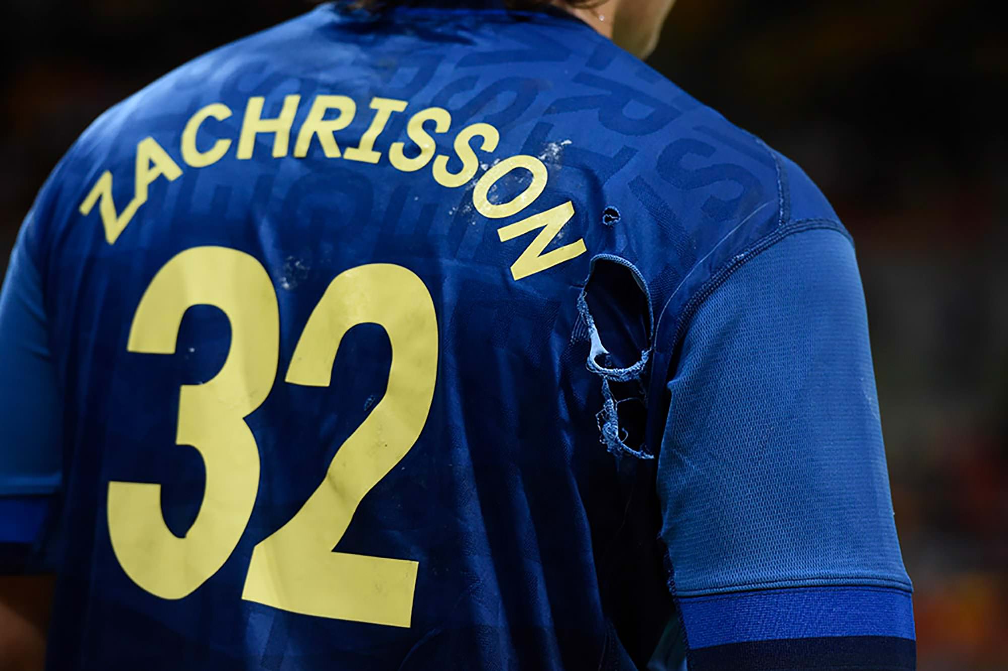
Sweden Sans in the olympics – Framåt Sverige!

Sweden Sans Regular

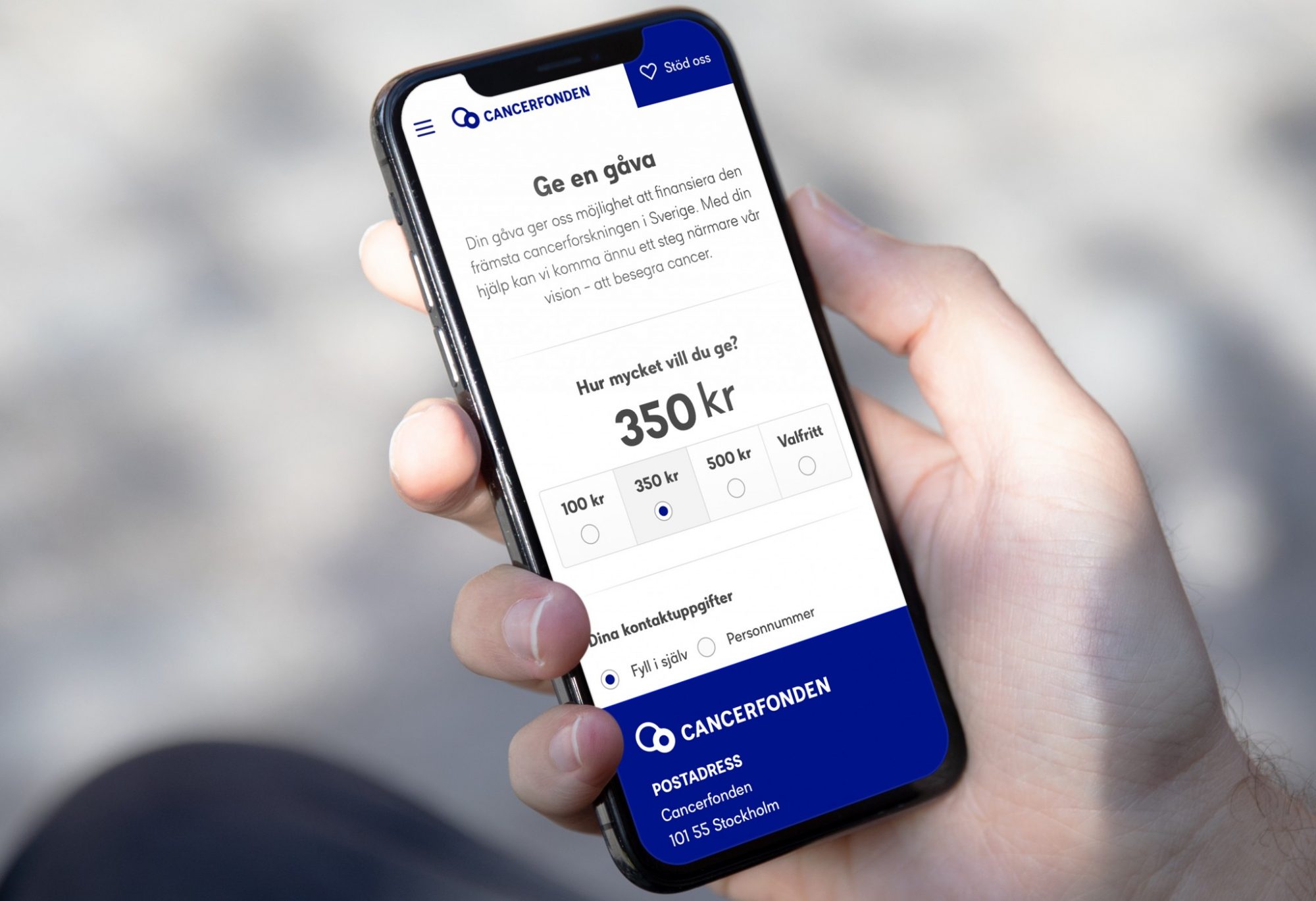
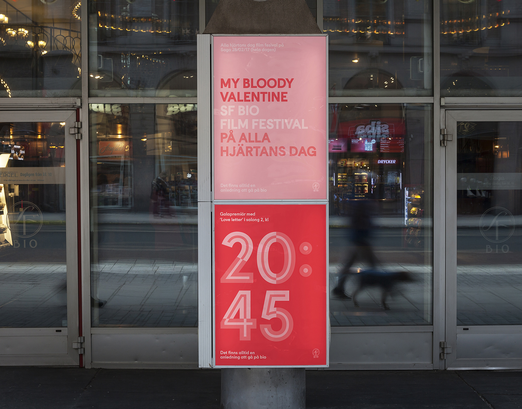
Sweden Sans – the primary typeface in the Sweden brand identity – It is simplicity combined with unique details that makes the typeface practical and versatile. We call it a ‘Lagom’ typeface.

Old road signs, monospaced fonts, classic sans serifs and Scandinavian design influenced and inspired us in the design process.

Sweden Sans Regular

Interact for Sweden Sans Bold

Old road signs, monospaced fonts, classic sans serifs and Scandinavian design influenced and inspired us in the design process.

Sweden Sans Bold

Interact for Sweden Sans Regular
Sweden Sans Light

It comes in 4 weights – Light, Regular, Bold and the Arabic version. Old road signs, monospaced fonts, classic sans serifs and Scandinavian design influenced and inspired us in the design process.

Sweden Sans
är ett typsnitt
för ett land
So Wrasse
Elroy
So Ray
So Sargo
Custom fonts