
Jernhusen
SANS
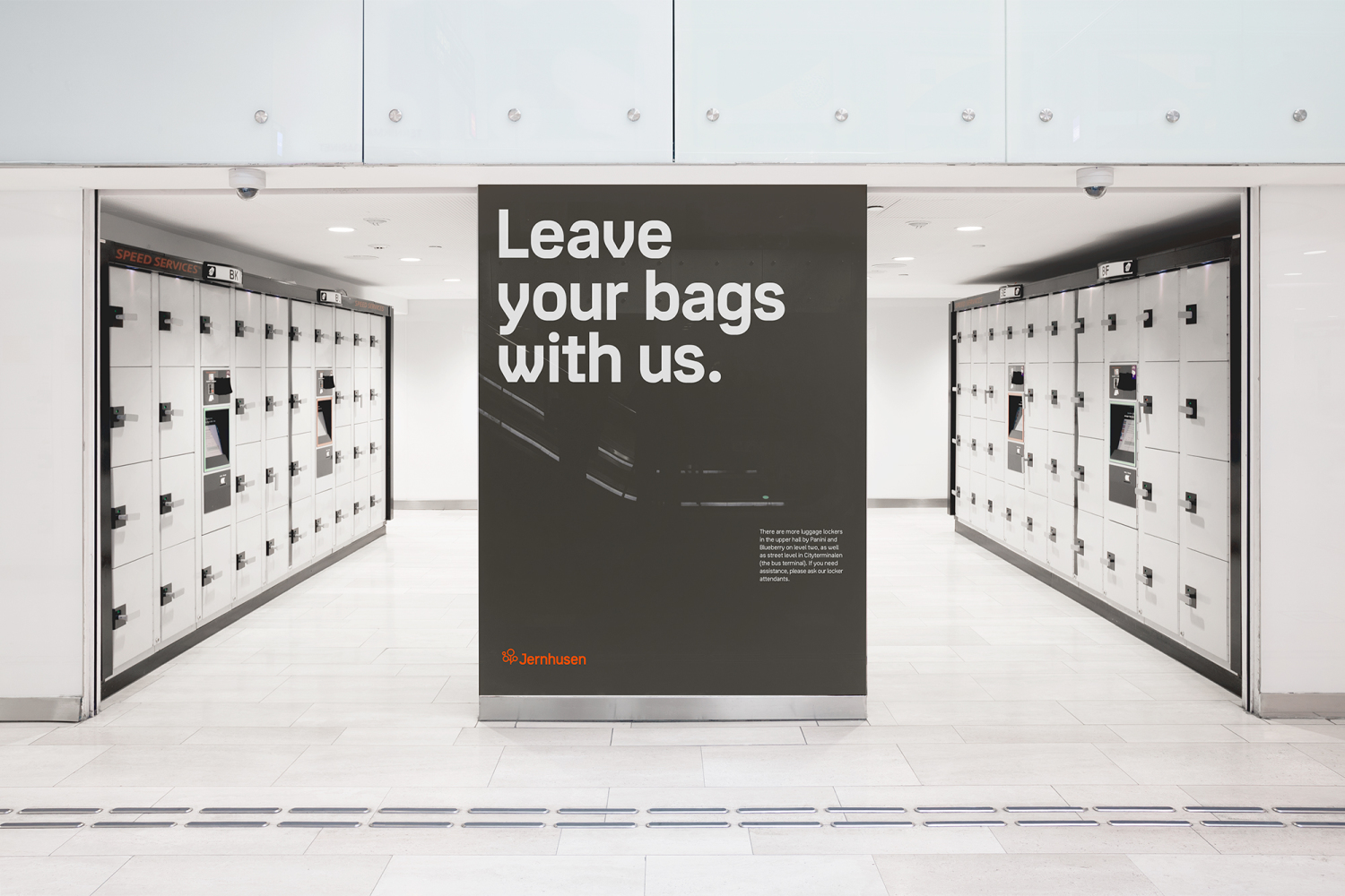
Jernhusen roots its design in the shape of railways and architectural development
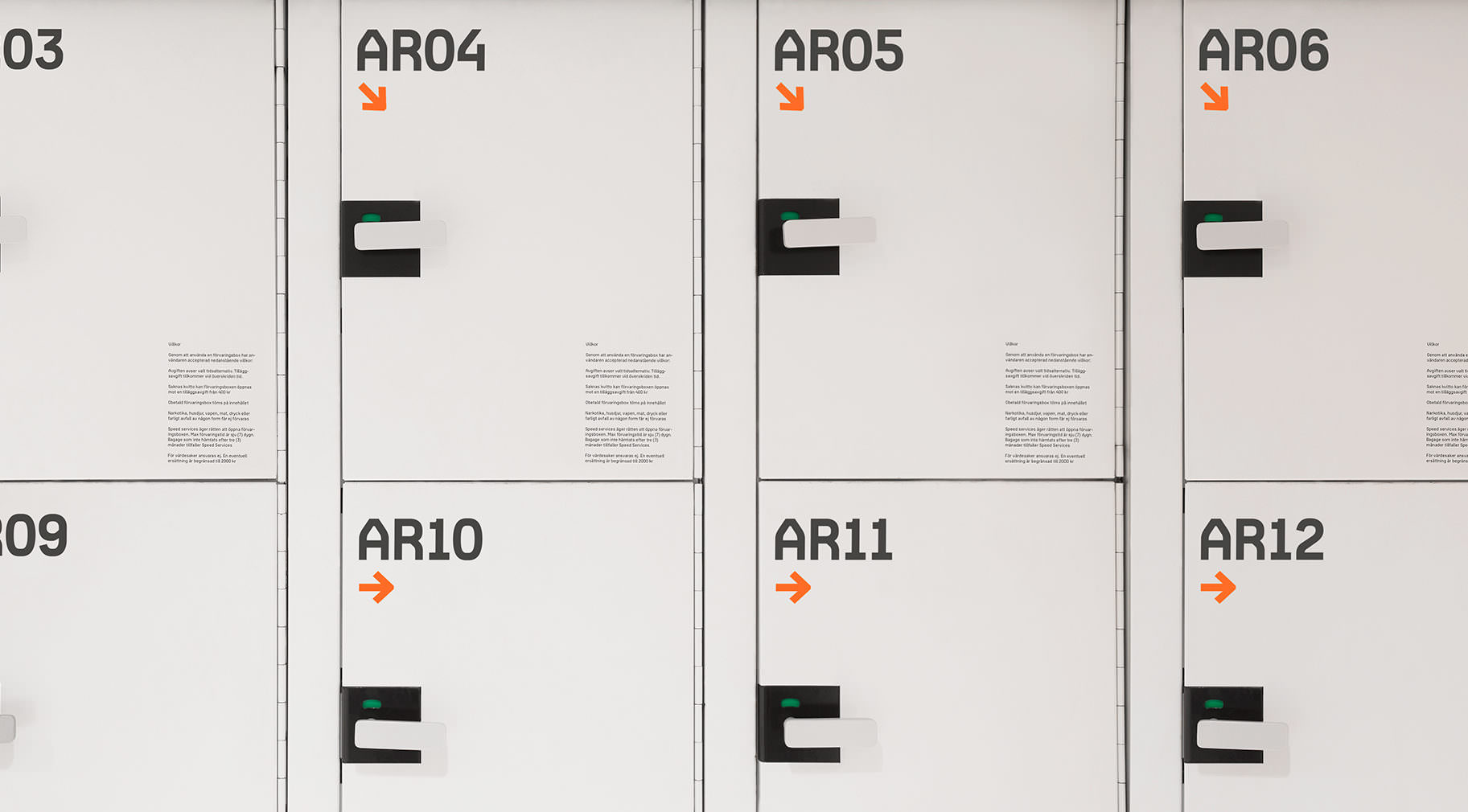
Jernhusens owns and runs railway stations and other buildings attached to the railway network of Sweden. We created a custom typeface as part of their new identity in an effort to bring clarity to the brand. Jernhusen Sans is a versatile typeface delivering both on readability and recognision by combining a high x-height and humanistic details with industrial shapes. We drew inspiration from industry related elements such as the shape of rails.
Jernhusen is a state-owned real estate developer. Their mission is both to maintain the current buildings along the Swedish railway system and build new commercial properties.
Consectetur adipiscing elit. Maecenas varius tortor nibh, sit amet tempor nibh finibus et. Aenean eu enim justo. Vestibulum aliquam hendrerit molestie. Mauris malesuada nisi sit amet augue accumsan tincidunt.
Consectetur adipiscing elit. Maecenas varius tortor nibh, sit amet tempor nibh finibus et. Aenean eu enim justo. Vestibulum aliquam hendrerit molestie. Mauris malesuada nisi sit amet augue accumsan tincidunt.
Consectetur adipiscing elit. Maecenas varius tortor nibh, sit amet tempor nibh finibus et. Aenean eu enim justo. Vestibulum aliquam hendrerit molestie. Mauris malesuada nisi sit amet augue accumsan tincidunt.
On the right track,
for years to come
On the right track,
for years to come

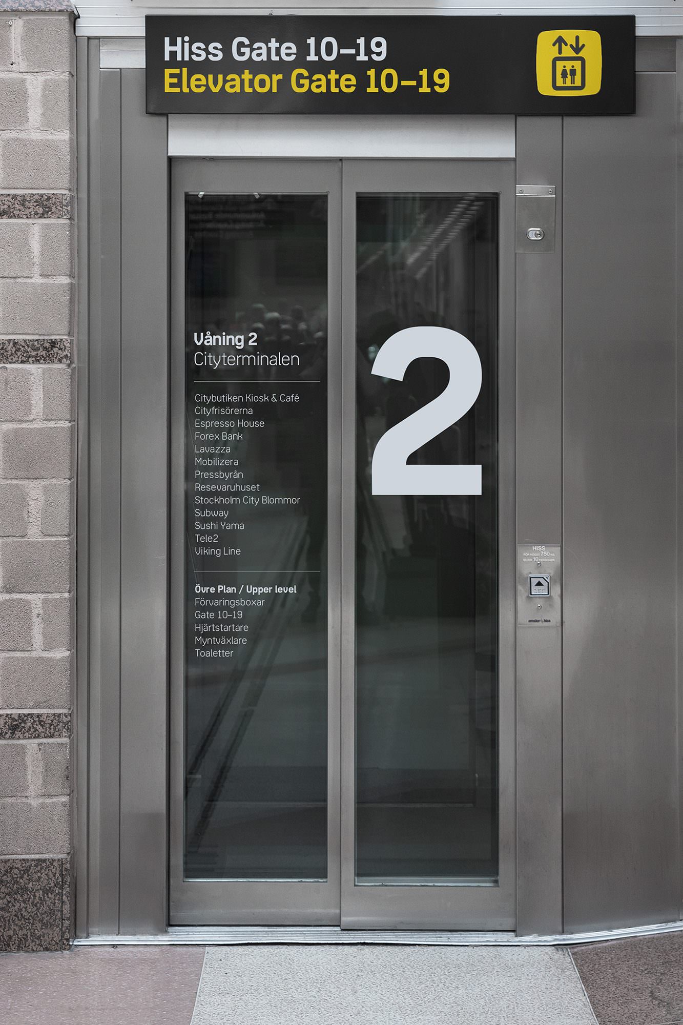
Jernhusen owns and runs railway stations and other buildings attached to the railway network in Sweden!
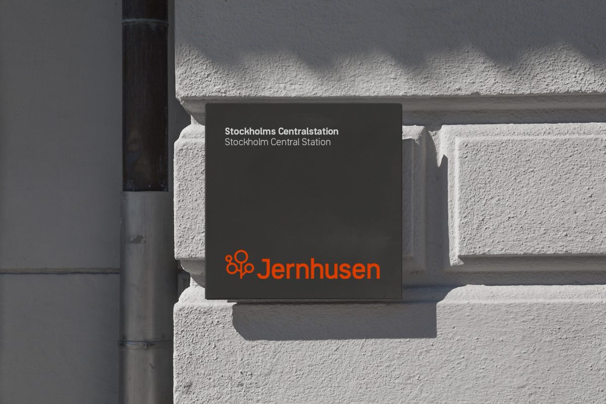
Used for all information and signs in the train stations all over Sweden. Roots in the shape of railways and in architectural development!
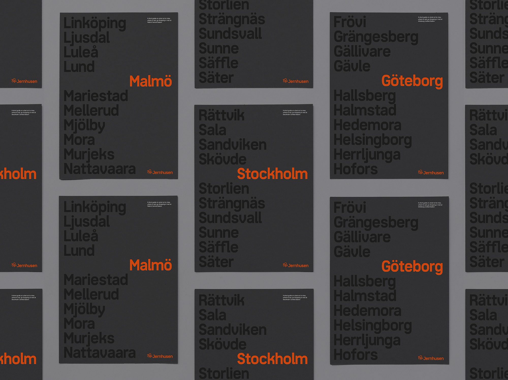
Creating legacies and
maintaining existing ones!